wild goose trail
A network of off-beat cycling and walking trail experiences that empower people to choose sustainable travel modes.
This university project challenged me to build a brand strategy, develop a visual identity and create a series of targeted below the line campaign media to pitch a new sustainability-led experience.
Cycling and walking have been central to my life for a long-time and I’m always keen to support people who want to incorporate more sustainable travel habits into their everyday lives and to enjoy the incredible health, social and environmental benefits that active travel brings - particularly when compared to car dependency.
The research is clear. People want to walk and cycle more but they are often intimidated by perceived safety concerns, a lack confidence and uncertainty about where to go. I developed Wild Goose Trail to provide a supportive space for people to build their walking and riding skills and local area knowledge and to feel empowered to confidently chose active travel.
Wild Goose Trail collects old bike tyres and inner tubes and re-purposes them into rubber wayfinding signs. These signs are used by passionate Trail Makers to create networks of off-beat trail experiences that showcase the area and inspire the local community to move more.
Brand strategy | visual identity | responsive logos | colour | print + digital ASSETS
> VISUAL IDENTITY
Wild Goose Trail is bright and eye-catching. Make it Pop Pink is the primary colour, and wants to be seen. The stencil typeface combined with the scratchy texture conveys a fun, guerrilla-style urban aesthetic whilst the goose icon is distinct and memorable.
Primary logo
> brand in the wild
The brand toolkit sets out the brand’s messaging and visual identity. This toolkit underpins a series of print and digital assets essential to the operation and promotion of Wild Goose Trail.
The brand toolkit sets out the messaging and identity
The Trail Maker Starter Kit provides everything needed to create trails
The goose icon is a key wayfinding marker
A stamp card rewards people who recycle old bike tyres and inner tubes
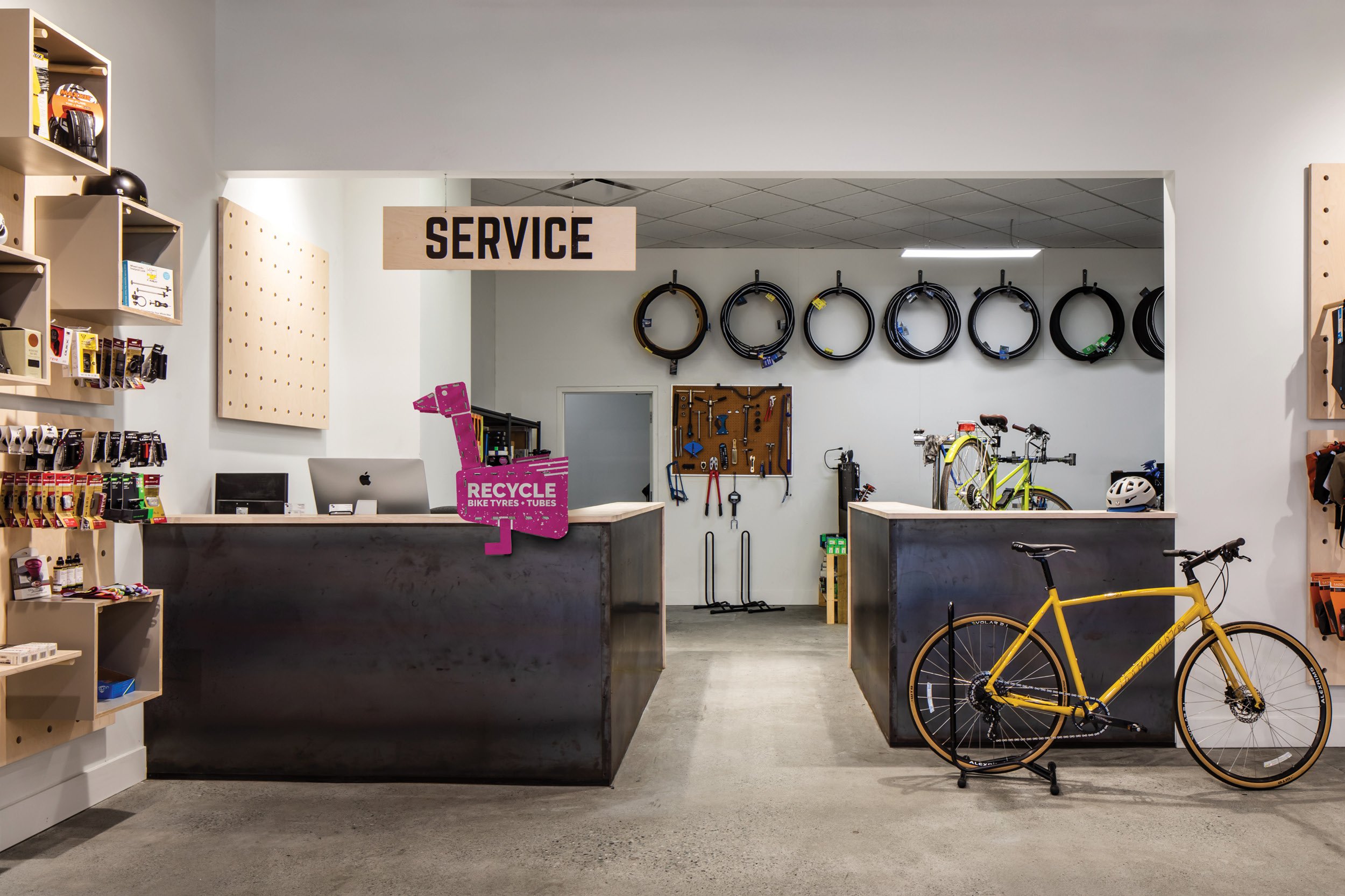
The unmissable Pink Goose bike tyre and inner tube collection point
The collection point sits on the counter-top in bike shops
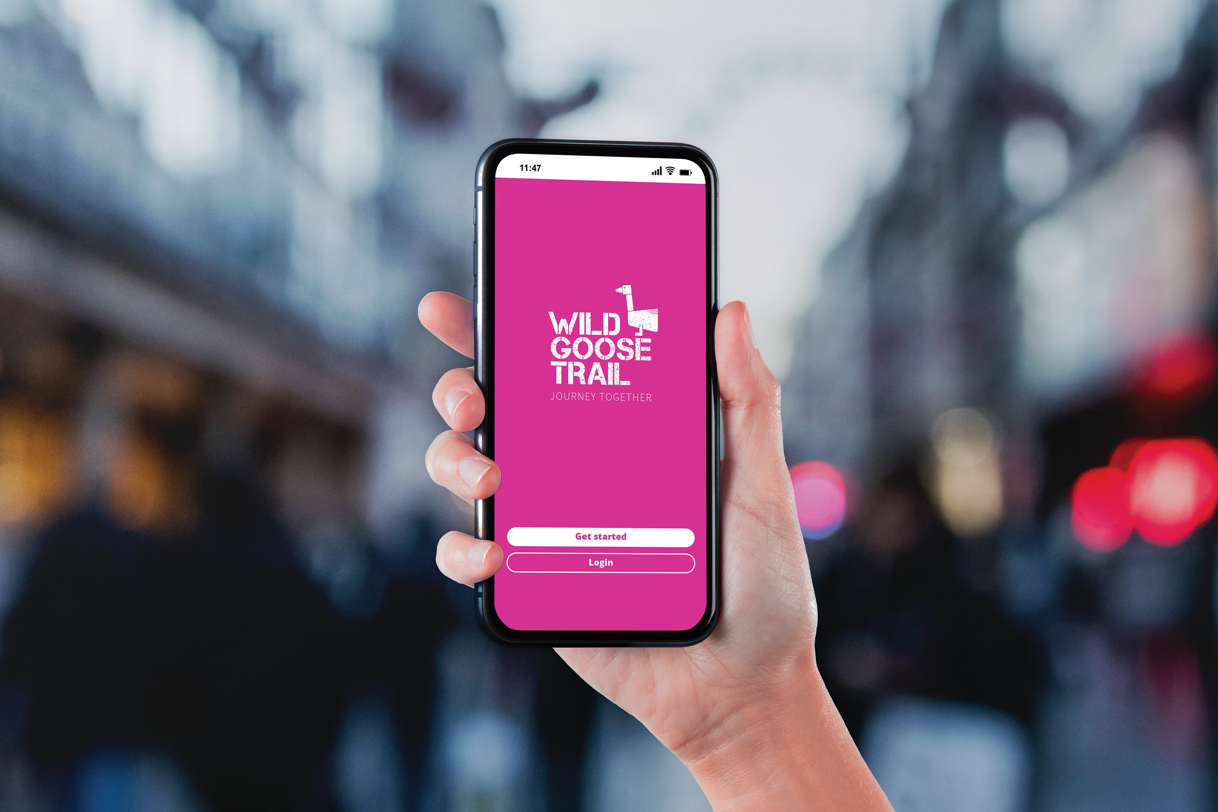
On-the-ground trail signs are supported by a mobile app
Trails are mapped, shared and navigated on the mobile app
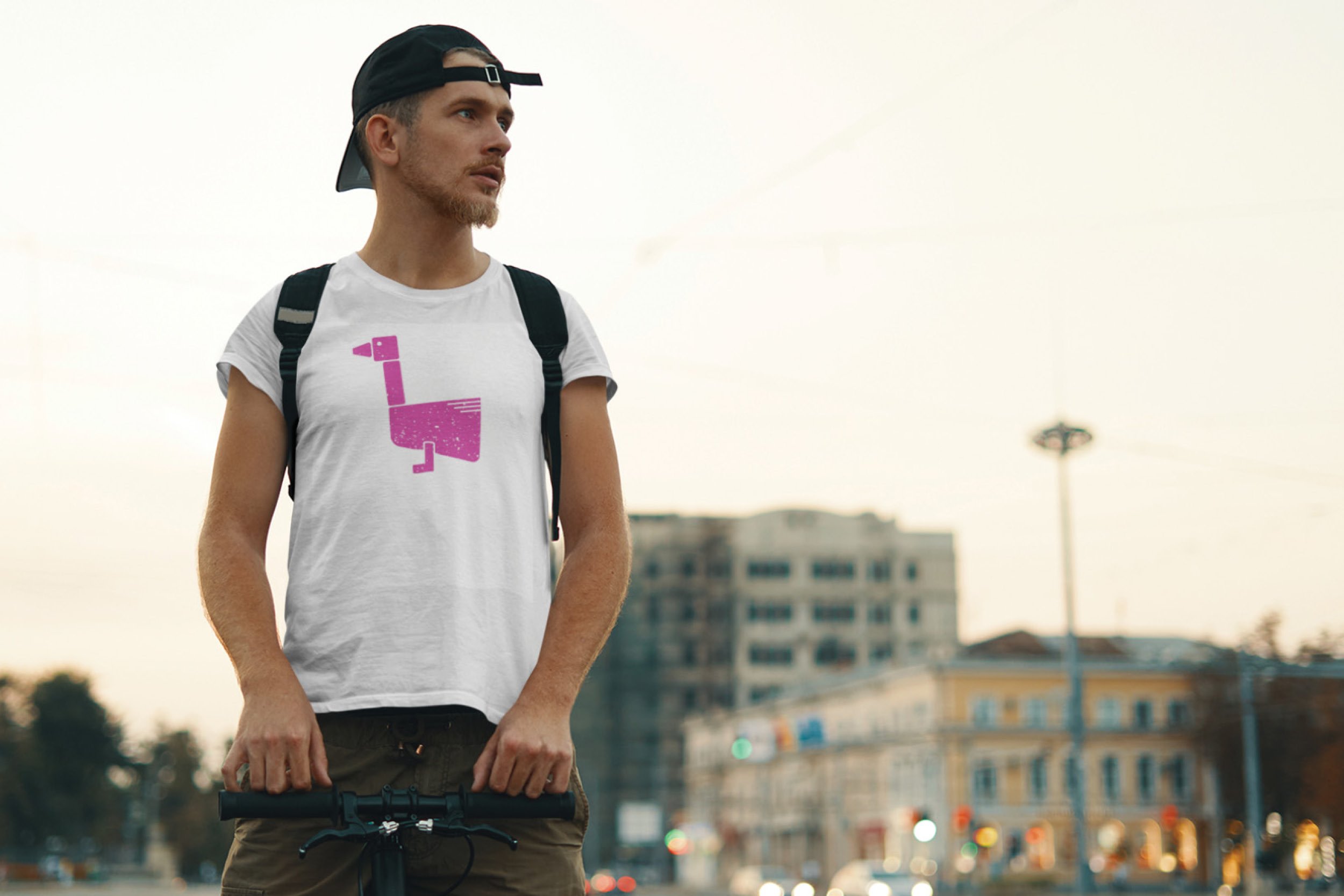
A clothing line provides an additional revenue opportunities
Make it Pop Pink is central to the brand’s identity
> the process
Early in this project I knew I needed a distinct and instantly recognisable icon for the trail signs, akin to the wayfinding symbols used on public footpath signs. The stencil-style goose icon emerged following ideation and soon became a key character in the brand as I translated the 2d design into a 3d cardboard mockup of the bike tyre and inner tube recycling collection box.
“A tremendous folio piece of sound below the line media. Outstanding work in all areas of conceptual thought, layout, design and content. Well done.”
- DO, Mentor, LCI Melbourne